
View the giant full-size (20 MB) version of this map.
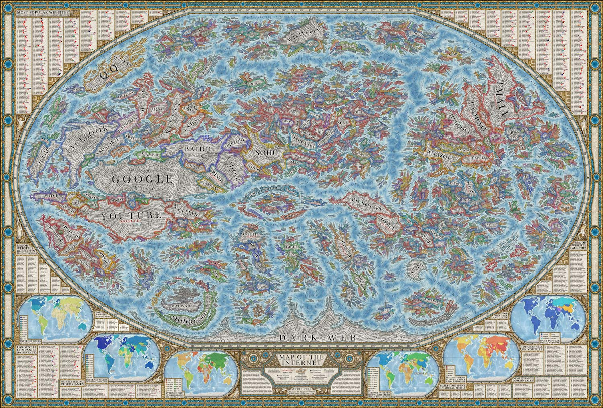
The internet is intangible, and because you can’t see it, it can be hard to comprehend its sheer vastness. As well, it’s difficult to gauge the relative size of different web properties. However, this map of the internet by Halcyon Maps offers a unique solution to these problems.
Inspired by the look and design of historical maps, this graphic provides a snapshot of the current state of the World Wide Web, as of April 2021. Let’s take a closer look!
But First, Methodology
Before diving into an analysis, it’s worth touching on the methodology behind this graphic’s design.
This map highlights thousands of the world’s most popular websites by visualizing them as “countries.” These “countries” are organized into clusters that are grouped by their content type (whether it’s a news website, search engine, e-commerce platform, etc).
Editor’s fun fact: Can you spot Visual Capitalist? We’re right in between TechCrunch and The Guardian above.
The colored borders represent a website’s logo or user interface. In terms of scale, each website’s territory size is based on its average Alexa web traffic ranking. The data is a yearly average, measured from January 2020 to January 2021.
Along the borders of the map, you can find additional information, from ranked lists of social media consumption to a mini-map of average download speeds across the globe.
According to the designer Martin Vargic, this map took about a year to complete.
[…]
Source: Mapped: A Detailed Map of the Online World in Incredible Detail

Robin Edgar
Organisational Structures | Technology and Science | Military, IT and Lifestyle consultancy | Social, Broadcast & Cross Media | Flying aircraft