
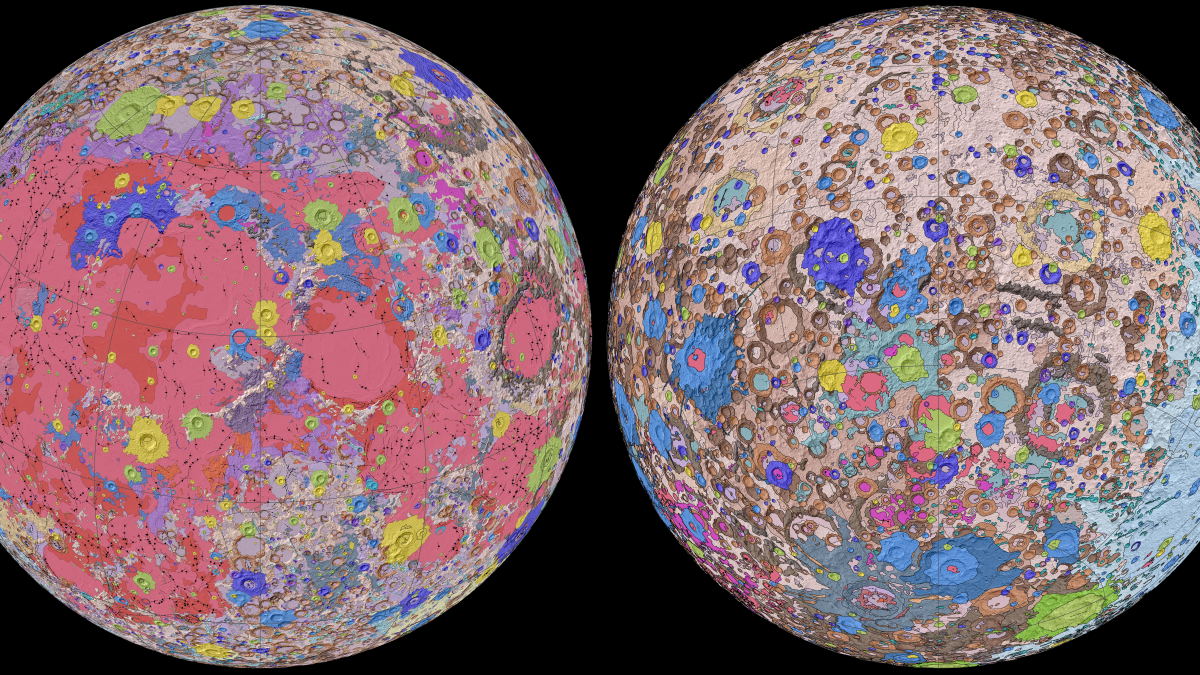
The colors divide the map into geologic units; scientists divide the Moon’s geologic history into a different eras, so a color represents the kind of rock and its era. For example, yellow on the map represents Copernican craters—the rim, wall, and floor of bright material from the Moon’s Copernican period, which lasted from a billion years ago to today. Shading represents topographical information.
Lunar maps have various uses to scientists. Skinner explained that they can show hazards as well as resources and where we might be able to develop the Moon, though mapping an extraterrestrial body to that level of detail is far off. Given this map’s scale, its main purpose is to serve as a summary of what scientists know about the Moon today. The map is available in a GIS (geographical information system) format that allows researchers to overlay their own scientific results on top of it in order to better put discoveries into context.
This isn’t the final version of the map, Skinner told Gizmodo. As scientists learn more about the Moon, we’ll start to see more tweaks. But ultimately, this map is a high-level overview, and higher-resolution maps will be needed to elucidate smaller sections of the Moon.
The team hopes their map will reach the broadest audience possible, and to be honest, I think it looks good enough to be framed on a wall. You can download the full map here.
Source: Incredible New Map of Moon Shows Its Every Nook and Cranny

Robin Edgar
Organisational Structures | Technology and Science | Military, IT and Lifestyle consultancy | Social, Broadcast & Cross Media | Flying aircraft