Late Wednesday night, Pornhub announced that PayPal is no longer supporting payments for Pornhub—a decision that will impact thousands of performers using the site as a source of income.
Most visitors to Pornhub likely think of it as a website that simply provides access to an endless supply of free porn, but Pornhub also allows performers to upload, sell, and otherwise monetize videos they make themselves. Performers who used PayPal to get paid for this work now have to switch to a different payment method.
“We are all devastated by PayPal’s decision to stop payouts to over a hundred thousand performers who rely on them for their livelihoods,” the company said on its blog. It then directed models to set up a new payment method, with instructions on how PayPal users can transfer pending payments.
“We sincerely apologize if this causes any delays and we will have staff working around the clock to make sure all payouts are processed as fast as possible on the new payment methods,” the statement said.
A PayPal spokesperson told Motherboard: “Following a review, we have discovered that Pornhub has made certain business payments through PayPal without seeking our permission. We have taken action to stop these transactions from occurring.”
PayPal is one of many payment processors that have discriminated against sex workers for years. Its acceptable use policy states that “certain sexually oriented materials or services” are forbidden—phrasing that’s intentionally vague enough to allow circumstances like this to happen whenever the company wants.
Are you a sex worker who has been impacted by this situation, or by any payment processors discriminating against your work? We’d love to hear from you. Contact Samantha Cole securely on Signal at +6469261726, direct message on Twitter, or by email.
The list of payment platforms, payment apps, and banks that forbid sexual services in their terms of use is very, very long, and includes everything from Venmo to Visa. Many of these terms have been in place for nearly a decade—and payment processors have been hostile toward sex work long before harmful legislation like the Fight Online Sex Trafficking Act came into law last year. But those laws only help to embolden companies to kick sex workers off their platforms, and make the situation even more confusing and frustrating for performers.
Researchers in Sussex have built a device that displays 3D animated objects that can talk and interact with onlookers.
A demonstration of the display showed a butterfly flapping its wings, a countdown spelled out by numbers hanging in the air, and a rotating, multicoloured planet Earth. Beyond interactive digital signs and animations, scientists want to use it to visualise and even feel data.
[…]
it uses a 3D field of ultrasound waves to levitate a polystyrene bead and whip it around at high speed to trace shapes in the air.
The 2mm-wide bead moves so fast, at speeds approaching 20mph, that it traces out the shape of an object in less than one-tenth of a second. At such a speed, the brain doesn’t see the moving bead, only the completed shape it creates. The colours are added by LEDs built into the display that shine light on the bead as it zips around.
Because the images are created in 3D space, they can be viewed from any angle. And by careful control of the ultrasonic field, the scientists can make objects speak, or add sound effects and musical accompaniments to the animated images. Further manipulation of the sound field enables users to interact with the objects and even feel them in their hands.
[…]
The images are created between two horizontal plates that are studded with small ultrasonic transducers. These create an inaudible 3D sound field that contains a tiny pocket of low pressure air that traps the polystyrene bead. Move the pocket around, by tweaking the output of the transducers, and the bead moves with it.
The most basic version of the display creates 3D colour animations, but writing in the journal Nature, the scientists describe how they improved the display to produce sounds and tactile responses to people reaching out to the image.
Speech and other sounds, such as a musical accompaniment, were added by vibrating the polystyrene bead as it hares around. The vibrations can be tuned to produce soundwaves across the entire range of human hearing, creating, for example, crisp and clear speech. Another trick makes the display tactile by manipulating the ultrasonic field to create a virtual “button” in mid-air.
The prototype uses a single bead and can create images inside a 10cm-wide cube of air. But future displays could use more powerful transducers to make larger animations, and employ multiple beads at once. Subramanian said existing computer software can be used to ensure the tiny beads do not crash into one another, although choreographing the illumination of multiple beads mid-air is another problem.
[…]
“The interesting thing about the tactile content is that it’s created using ultrasound waves. Unlike the simple vibrations most people are familiar with through smartphones or games consoles, the ultrasound waves move through the air to create precise patterns against your hands. This allows multimedia experiences where the objects you feel are just as rich and dynamic as the objects you see in the display.”
Julie Williamson, also at Glasgow, said levitating displays are a first step towards truly interactive 3D displays. “I imagine a future where 3D displays can create experiences that are indistinguishable from the physical objects they are simulating,” she said.
The fossil fuels driving climate change make people sick, and so do impacts like extreme heat, wildfires, and more extreme storms, according to research published on Wednesday. In short, the climate crisis is a public health crisis.
A new report from premiere medical journal the Lancet tallies the medical toll of climate change and finds last year saw record-setting numbers of people exposed to heat waves and a near-record spread of dengue fever globally. The scientists also crunched numbers around wildfires for the first time, finding that 77 percent of countries are facing more wildfire-induced suffering than they were at the start of the decade. But while some of the report’s findings are rage-inducing, it also shows that improving access to healthcare may be among the most beneficial ways we can adapt to climate change.
[…]
Heat waves are among the more obvious climate change-linked weather disasters, and the report outlines just how much they’re already hurting the world. Last year saw intense heat waves go off around the world from the UK to Pakistan, to Japan amid the fourth warmest year on record.
[…]
The report also found that 2018 marked the second-worst year since accurate record keeping began in 1990 for the spread of dengue fever-carrying mosquitoes. The two types of mosquitoes that transmit dengue have seen their range expand as temperatures have warmed
[…]
wildfire findings, which are new to this year’s report. Scientists found that more than three-quarters of countries around the world are seeing increased prevalence of wildfires and the sickness-inducing smoke that accompanies them.
[…]
there are also the health risks that come from burning fossil fuels themselves. Air pollution has ended up in people’s lungs where it can cause asthma and other respiratory issues, but it’s also showed up in less obvious locations like people’s brains and women’s placentas.
[…]
“We can do better than to dwell on the problem,” Gina McCarthy, the former head of the Environmental Protection Agency and current Harvard public health professor, said on the press call.
The report found, for example, that despite an uptick in heat waves and heavy downpours that can spur diarrheal diseases, outbreaks have become less common. Ditto for protein-related malnutrition despite the impact intense heat is having on the nutritional value of staple crops and ocean heat waves on coral reefs and fisheries that rely on them. At least some of that is attributable to improved access to healthcare, socioeconomic opportunities, and sanitation in some regions.
We often think about sea walls or other hard infrastructure when it comes to climate adaptation. But rural health clinics and sewer systems fall into that same category, as do programs like affordable crop insurance. The report suggests improving access to financing health-focused climate projects could pay huge dividends as a result, ensuring that people are insulated from the impacts of climate change and helping lift them out of poverty in the process. Of course it also calls for cutting carbon pollution ASAP because even the best equipped hospital in the world isn’t going to be enough to protect people from the full impacts of climate change.
Google will soon offer checking accounts to consumers, becoming the latest Silicon Valley heavyweight to push into finance. The Wall Street Journal: The project, code-named Cache, is expected to launch next year with accounts run by Citigroup and a credit union at Stanford University, a tiny lender in Google’s backyard. Big tech companies see financial services as a way to get closer to users and glean valuable data. Apple introduced a credit card this summer. Amazon.com has talked to banks about offering checking accounts. Facebook is working on a digital currency it hopes will upend global payments. Their ambitions could challenge incumbent financial-services firms, which fear losing their primacy and customers. They are also likely to stoke a reaction in Washington, where regulators are already investigating whether large technology companies have too much clout.
The tie-ups between banking and technology have sometimes been fraught. Apple irked its credit-card partner, Goldman Sachs Group, by running ads that said the card was “designed by Apple, not a bank.” Major financial companies dropped out of Facebook’s crypto project after a regulatory backlash. Google’s approach seems designed to make allies, rather than enemies, in both camps. The financial institutions’ brands, not Google’s, will be front-and-center on the accounts, an executive told The Wall Street Journal. And Google will leave the financial plumbing and compliance to the banks — activities it couldn’t do without a license anyway.
Popular health websites are sharing private, personal medical data with big tech companies, according to an investigation by the Financial Times. The data, including medical diagnoses, symptoms, prescriptions, and menstrual and fertility information, are being sold to companies like Google, Amazon, Facebook, and Oracle and smaller data brokers and advertising technology firms, like Scorecard and OpenX.
The investigation: The FT analyzed 100 health websites, including WebMD, Healthline, health insurance group Bupa, and parenting site Babycentre, and found that 79% of them dropped cookies on visitors, allowing them to be tracked by third-party companies around the internet. This was done without consent, making the practice illegal under European Union regulations. By far the most common destination for the data was Google’s advertising arm DoubleClick, which showed up in 78% of the sites the FT tested.
Responses: The FT piece contains a list of all the comments from the many companies involved. Google, for example, said that it has “strict policies preventing advertisers from using such data to target ads.” Facebook said it was conducting an investigation and would “take action” against websites “in violation of our terms.” And Amazon said: “We do not use the information from publisher websites to inform advertising audience segments.”
A window into a broken industry: This sort of rampant rule -breaking has been a dirty secret in the advertising technology industry, which is worth $200 billion globally, ever since EU countries adopted the General Data Protection Regulation in May 2018. A recent inquiry by the UK’s data regulator found that the sector is rife with illegal practices, as in this case where privacy policies did not adequately outline which data would be shared with third parties or what it would be used for. The onus is now on EU and UK authorities to act to put an end to them.
The social media giant said the number of government demands for user data increased by 16% to 128,617 demands during the first half of this year compared to the second half of last year.
That’s the highest number of government demands it has received in any reporting period since it published its first transparency report in 2013.
The U.S. government led the way with the most number of requests — 50,741 demands for user data resulting in some account or user data given to authorities in 88% of cases. Facebook said two-thirds of all the U.S. government’s requests came with a gag order, preventing the company from telling the user about the request for their data.
But Facebook said it was able to release details of 11 so-called national security letters (NSLs) for the first time after their gag provisions were lifted during the period. National security letters can compel companies to turn over non-content data at the request of the FBI. These letters are not approved by a judge, and often come with a gag order preventing their disclosure. But since the Freedom Act passed in 2015, companies have been allowed to request the lifting of those gag orders.
The report also said the social media giant had detected 67 disruptions of its services in 15 countries, compared to 53 disruptions in nine countries during the second half of last year.
And, the report said Facebook also pulled 11.6 million pieces of content, up from 5.8 million in the same period a year earlier, which Facebook said violated its policies on child nudity and sexual exploitation of children.
The social media giant also included Instagram in its report for the first time, including removing 1.68 million pieces of content during the second and third quarter of the year.
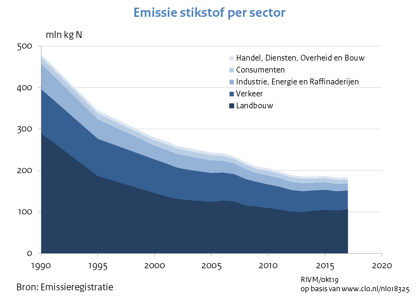
Right now, in the Netherlands there is talk about reducing the speed limit from 130kph to 100kph in order to comply to emissions goals set by the EU (and supported by NL) years ago. Because NL didn’t put into effect any necessary legislation years ago, this is now coming to bite NL in the arse and they are playing panic football.
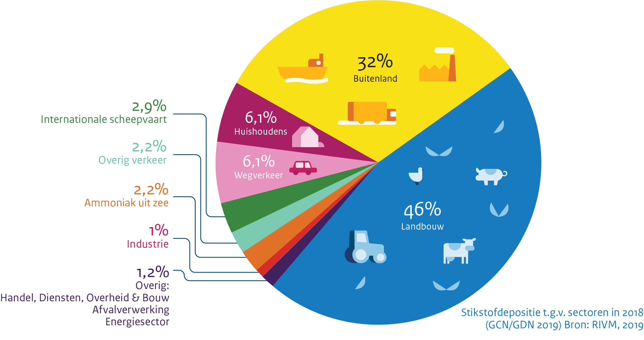
The Dutch institute for the environment shows pretty clearly where emissions are coming from:
As you can see it makes perfect sense to do something about traffic, as it causes 6.1% of emissions. Oh wait, there’s the farming sector: that causes 46% of emissions! Why not tackle that? Well, they tried to at first, but then the farmers did an occupy of the Hague with loads of tractors (twice) and all the politicians chickened out. Because nothing determines policy like a bunch of tractors causing traffic jams. Screw the will of the people anyway.
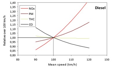
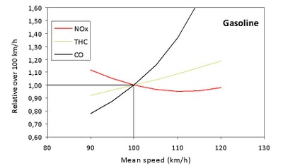
Note: emissions expressed
relative to their values at 100 km/h, for which the value ‘1’ is assigned.
Source: EMISIA – ETC/ACM
So reducing speed from 120-100 kph should result (for diesels) in an approx 15% decrease in particulate matter, a 40% decrease in nitrogen oxides but an increase in the amount of total hydrocarbons and carbon monoxides.
For gasoline powered cars the it’s a 20% decrease in total hydrocarbons, which means that in NL, we can knock down the 6.1% of the pie generated by cars to around 4%. Yay. We don’t win much.
Now about traffic flow, because that’s what I’m here for. The Dutch claim that lowering the speed limit will decrease the amount of time spent in traffic jams. Here’s an example of two experts saying so in BNN Vara’s article Experts: Door verlaging maximumsnelheid ben je juist sneller thuis
However, if you look at their conclusion, they come straight out of one of just two studies commonly used by seemingly everyone:
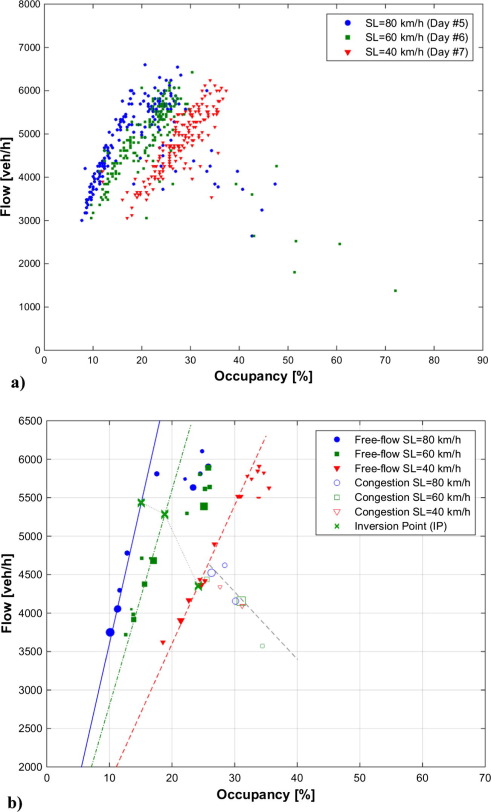
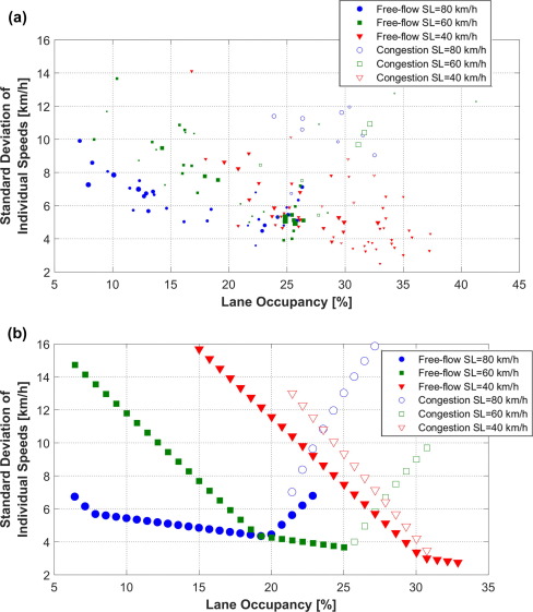
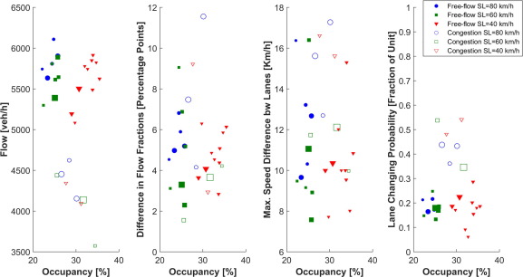
It is confirmed that the lower the speed limit, the higher the occupancy to achieve a given flow. This result has been observed even for relatively high flows and low speed limits. For instance, a stable flow of 1942 veh/h/lane has been measured with the 40 km/h speed limit in force. The corresponding occupancy was 33%, doubling the typical occupancy for this flow in the absence of speed limits. This means that VSL strategies aiming to restrict the mainline flow on a freeway by using low speed limits will need to be applied carefully, avoiding conditions as the ones presented here, where speed limits have a reduced ability to limit flows. On the other hand, VSL strategies trying to get the most from the increased vehicle storage capacity of freeways under low speed limits might be rather promising. Additionally, results show that lower speed limits increase the speed differences across lanes for moderate demands. This, in turn, also increases the lane changing rate. This means that VSL strategies aiming to homogenize traffic and reduce lane changing activity might not be successful when adopting such low speed limits. In contrast, lower speed limits widen the range of flows under uniform lane flow distributions, so that, even for moderate to low demands, the under-utilization of any lane is avoided.
There are a few problems with this study: First, it’s talking about speed limits of 40, 60 and 80 kph. Nothing around the 100 – 130kph mark. Secondly, the data in the graphs actually shows a lower occupancy with a higher speed limit – which is not their conclusion!
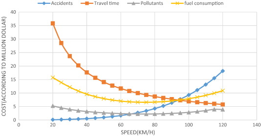
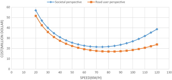
This paper aims to evaluate optimal speed limits in traffic networks in a way that economized societal costs are incurred. In this study, experimental and field data as well as data from simulations are used to determine how speed is related to the emission of pollutants, fuel consumption, travel time, and the number of accidents. This paper also proposes a simple model to calculate the societal costs of travel and relate them to speed. As a case study, using emission test results on cars manufactured domestically and by simulating the suburban traffic flow by Aimsun software, the total societal costs of the Shiraz-Marvdasht motorway, which is one of the most traversed routes in Iran, have been estimated. The results of the study show that from a societal perspective, the optimal speed would be 73 km/h, and from a road user perspective, it would be 82 km/h (in 2011, the average speed of the passing vehicles on that motorway was 82 km/h). The experiments in this paper were run on three different vehicles with different types of fuel. In a comparative study, the results show that the calculated speed limit is lower than the optimal speed limits in Sweden, Norway, and Australia.
(Emphasis mine)
It’s a compelling study with great results, which also include accidents.
In a multi-lane motorway divided by a median barrier in Sweden, the optimal speed is 110 km/h. The speed limit is 110 km/h and the current average speed is 109 km/h. In Norway, the optimal speed from a societal perspective is 100 km/h and the speed limit is 90 km/h. The current average speed is 95 km/h [2]. In Australia, the optimum speeds on rural freeways (dual carriageway roads with grade-separated intersections) would be 110 km/h [3]. Table 3 compares the results in Elvik [2] and Cameron [3] with those of the present study.
Table 3. Optimal speed in Norway, Sweden, Australia, and Iran. Source for columns 2 and 3: Elvik [2]. Source for column 4: Cameron [3].
Norway
Sweden
Australia
Iran
Optimal speed limits (km/h) according to societal perspective
100
110
110
73
Optimal speed limits (km/h) according to road user perspective
110
120
–
82
Current speed limits (km/h)
90
110
110
110
Current mean speed of travel (km/h)
95
109
–
82
There is a significant difference between the results in Iran and those in Sweden, Norway, and Australia; this difference results from the difference in the costs between Iran and these three countries. Also, the functions of fuel consumption and pollutant emission are different.
If you look at the first graph, you can be forgiven for thinking that the optimum speed is 95 kph, as Ruud Horman (from the BNN Vara piece) seems to think. However, as the author of this study is very careful to point out, it’s a very constrained study and there are per country differences – these results are only any good for a very specific highway in a very specific country.
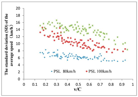
They come out with a whole load of pretty pictures based on the following graph:
x= intensity, y= speed.
There are quite a lot of graphs like this. So, the speed limit is 120kph (red dots) and the inttesity is 6000 (heavy) then the actual speed is likely to be around 100 kph op the A16. However if the speed limit is 130 kph with the same intensity – oh wait, it doesn’t get to the same intensity. You seem to have higher intensities more often with a speed limit of 120 kph. But if we have an intensity of around 3000 (which I guess is moderate) then you see that quite often the speed is 125 with a speed limit of 130 and around 100 with a speed limit of 120. However, with that intensity you see that there are slightly more datapoints at around 20 – 50 kph if your speed limit is 130kph than if it’s 120kph.
Oddly enough, they never added data from 100kph, of which there were (and are) plenty of roads. They also never take into account variable speed limits. The 120kph limit is based on data taken in 2012 and the 130kph limit is based on data from 2018.
Their conclusion – raising the speed limit wins you time when the roads are quiet and puts you into a traffic jam when the roads are busy – is spurious and lacks the data to be able to support it.
The conclusion is pretty tough reading but the graphs are quite clear
What they are basically saying is: we researched it pretty well and we had a look at the distribution of vehicle types. Basically, if you set a higher speed limit, people will drive faster. There is variability (the bars you see up and down the lines) so sometimes they will drive faster and somethims they will drive slower but they generally go faster on average with a higher speed limit.
Now one more argument is that the average commute is only about an hour per day. So if you go slower, you will only save a few minutes. The difference between 100 and 130kph is a 30% difference. Over an hour period (say 100 km), that’s a 21 minute difference, assuming you can travel that distance at that speed (what they call free flow conditions). Sure you’ll never get that, but over large distances you can come close. Anyway, say we halve that and say it’s a 10 minute difference. The argument becomes that this is just barely a cup of tea. But it’s 10 minutes difference EVERY WORKING DAY! Excluding weekends and holidays, you can expect to make that commute around 250 times per year, making your net loss 2500 minutes (at least), which is 41 hours or a full working week you now have to spend extra in the car!
– reducing the speed limit seems like poor populist policy to appease the farmers, look like Something is Being Done ™ and not actually get anything real to happen except piss off commuters.
According to a Verizon press release, the new Motorola Razr will clock in at the eye-popping price of $1,500 retail (still less than foldable competitors Samsung Galaxy Fold at $1,980 or more and Huawei Mate X at $2,420). Its 6.2-inch screen is ultrawide and the device packs a 16-megapixel main camera; Verizon added that when folded, the Razr’s “touchscreen Quick View external display lets you respond to notifications, take selfies, play your music, use Google Assistant, and more without having to flip open your phone.”
Graphic: Verizon
Graphic: Verizon
Slashgear has some more details on the device, including that the main display is a pOLED running at 2142 x 876 resolution while the Quick View display is a 2.7-inch OLED running at 600 x 800. Replying to text messages and emails via the external display requires using smart replies or dictation, though it will also function as a music controller and preview screen for the camera. It also has a Snapdragon 710 processor, 6GB of memory, and 128GB of storage, running Android Pie 9.
Graphic: Verizon
Downsides noted by Slashgear include no wireless charging and fast charging that caps out at 15W, as well as a 2,510 mAh battery. That’s considerably lower than the 3,000 mAh battery in Samsung’s flagship Galaxy S10 and newer iPhones, most models of which come in closer to or slightly over 3,000 mAh. Additionally, the new Razr follows other manufacturers’ leads by ditching the 3.5mm headphone jack for a USB-C connector, a decision widely reviled by consumers used to simply plugging in whatever headphones they have available at the moment. And despite Verizon’s big talk about their 5G network, the Razr will cap out at current-gen 4G LTE speeds.